Design Description: Zippo is designed with commemorative themes. I have considered the effect of Zippo lighters as a substitute for candles from the history of zippo 73 years, and using candles as the starting point of my design, commemorating the replacement of candles and lighting;
This packaging is created in a less internationalized design style, with a simple form, iron material and Zippo's simple and sturdy chrome-plated copper housing to achieve a visual response. The exterior design has the rough personality characteristics of Native Americans, just as the American brands Harley Motorcycle and Hummer Automotive generally have that practical but unassuming design style with American culture.
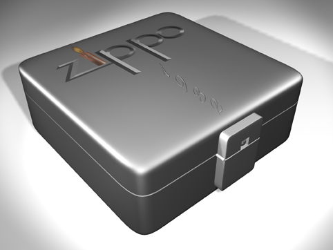
Only the Zippo logo and the representative 1932 appeared on the packaging surface. In Zippo's logo design, I used the design starting point candle as a design element, replacing the Zippo's i letter with a figurative candle. The other letters use the connection between their strokes to achieve the formal beauty. Zippo's logo and 1932 are placed in a T-shape, from top to bottom, to achieve a plane division with a sense of direction and impact.
From the perspective of the visual process, the observer's attention initially focused on the candle that was color but not prominent, and then expanded to see the Zippo logo and then saw the year from 1932 to find a suitable plane. structure type.
To open this box, you can see that the lock is also a small Zippo lighter shape, and when you open it can also hear Zippo's patented and unique sounding, and you can see English on top of him. The name of the place is where the Zippo Plant is located. Open the lid and run into your eyes is a Zippo lying on top of white wax. The chrome-plated copper material is coordinated with the crystal clear wax and once again highlights the design theme. On the inner surface of the upper cover, the history of Zippo's glory and connotation is imprinted, and a word of Zippo is carved on the wax, adding a touch of color to this unified tone. Breaking the silence of the screen once again highlights the Zippo logo.
The thinking process of this packaging: to find the design starting point, so there is a concrete acquisition, then an abstract search, and then complete the entire design based on the starting point. [COLOR=#DC143C] There are many posts like this one, and this post doesn't make sense!
(China Packaging Design Network)